Covid-19 Impact on Businesses in Bellevue, WA
Data Analysis project


Introduction
It has been more than two years since Covid-19 pandemic started in the U.S. Though our lives are getting back to normal, Covid's impact to our society is significant. A few weeks ago, my wife told me about her observation that it seemed like there were a lot more small businesses poping up near the area where we lived on Google Map, and she speculated that is was mainly due to Covid's influence. So, I decided to prove or disprove this by applying my data analysis skill, and I will walk through how I did it in this post.
Dataset
Thanks to City of Bellevue | Open Data, I download Business Listing dataset here on May 29,2022. It's a tabular data containing information of new business such as names, addresses and start date. There are 41,407 business with start date ranging from 1953 to 2022
business = pd.read_csv("data/Business_Listing.csv", low_memory=False)
for date_col in ['CancelDate','FirstActivityDate','IssueDate']:
    business[date_col] = pd.to_datetime(business[date_col])
business.shape[0], business['IssueDate'].min(),business['IssueDate'].max()
business.head()
Since we are interested in Covid's influence on new businesses, IssueDate (start date) would be critical to help us determine the business started before or after pandemic. We will drop 217 business with missing IssueDate.
print(business['IssueDate'].isna().sum())
business = business.dropna(subset=['IssueDate'])
The dataset also has Naic column, which stands for North American Industry Classification, often called NAICS code. This system classifies businesses by their types of economic activity and assign codes to uniquely identify the classification. We can extract sector and industry information from NAICS code for each business, which is extremely helpful for visualizing business trend based on their economic activities. I also package the functions to convert NAICS codes to sectors and industries and upload to PyPI. Here is a sample of result:
business["Sector"] = naics2sectors(business["Naic"])
business["Industry"] = naics2industries(business["Naic"])
business['Year'] = business['IssueDate'].dt.year
business[['LegalEntityName','Dba','Sector','Industry']].head(2)
Addresses
My initial approach is to classify businesses based on whether the address is residential or commercial by fetching residential delivery indicator(RDI). Unfortunately, it's only feasible with paid API (which I am reluctant to get for a hobby project). But, we can still plot business locations on a map. Mapbox provides free limited API request for its awesome Maps service. In addition, we use lock down date, March 24, 2020, to divid businesses into pre-covid and post-covid, and truncate the dataset to keep only businesses with IssueDate after 2017 to avoid pre-covid business overwhelm post-covid ones in the plots, and the time intervals are very close between pre-covid and post covid, which are both about 2 years and 3 months.
# business['post_covid'] = (business['IssueDate'] >= '2020-03-24')
# business = business[business['Year']>2017]
# with open('mapbox_token.json','r') as openfile:
#     mapbox_token = json.load(openfile)
# px.set_mapbox_access_token(mapbox_token['token'])
# fig = px.scatter_mapbox(business,lat='Y',lon='X',color='post_covid',zoom=10,
#                         hover_name='LegalEntityName',opacity=0.6,title='Business Listing in Bellevue Pre/Post Covid-19')
# fig.show()

## map produced by Plotly.js can't be properly rendered by fastpages
## so, use image instead
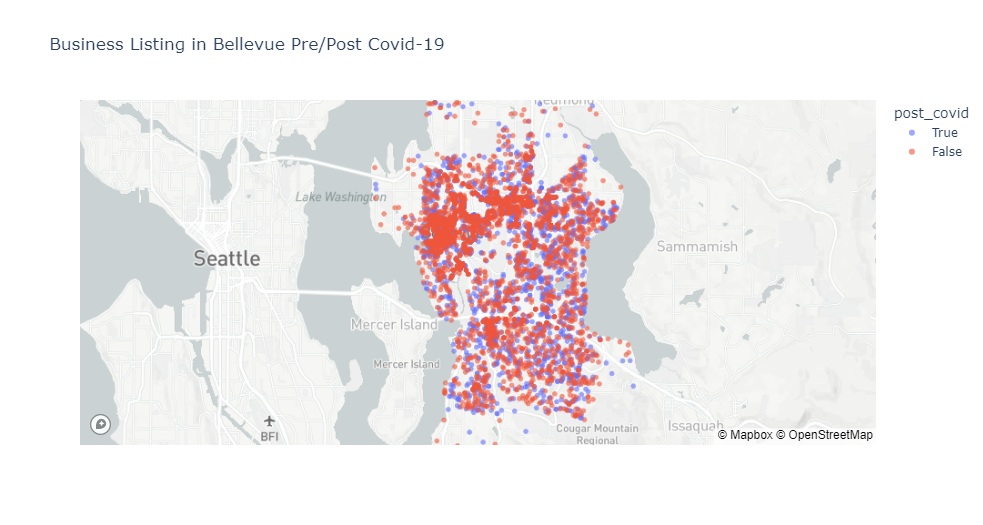
Blue dots represent post-covid businesses, and we can see they are more spread out. This may implies post-covid new businesses tend to locate in residential area, but we can't draw a conclusion merely based on the map plot. Let's see if we can find other useful insights from the dataset.
all_sectors = business['Sector'].value_counts()
labels = all_sectors.index.to_list()
colors = dict(zip(labels,plt.cm.tab20.colors[:len(labels)]))
colors['Other'] = plt.cm.tab20_r.colors[2]
def plot_sector(year):
    plt.figure(figsize=(12,8))
    sector_count = business[business['Year']==year]['Sector'].value_counts()
    sector_count[10] = sum(sector_count[10:])
    sector_count = sector_count[:11]
    sector_index = sector_count.index.to_list()
    sector_index[10] = 'Other'
    sector_count.index = sector_index
    explode = np.zeros(11)
    explode[sector_index.index("Accommodation and Food Services")] = 0.35
    ax = sector_count.plot.pie(autopct='%1.1f%%',explode=explode,wedgeprops={'linewidth': 1.0, 'edgecolor': 'white'},colors=[colors[key] for key in sector_count.index],textprops={'fontsize':12})
    plt.title(year)
    plt.ylabel("")
    plt.tight_layout()
for year in sorted(business['Year'].unique(),reverse=True):
    plot_sector(year)
plt.show()


Altough sector distribution doesn't vary much, we can tell Accommodation and Food Services shows a slight down trend since 2020, which could be a result of the pandemic. Let's look at industry data.
industry_dict = {}
post_covid = set()
pre_covid = set()
for year in sorted(business['Year'].unique(),reverse=True):
    industry_count = business[business['Year']==year]['Industry'].value_counts()
    industry_count = industry_count[:10]
    industry_dict[year] = industry_count.index
    if year < 2020:
        pre_covid.update(industry_count.index)
    else:
        post_covid.update(industry_count.index)
pd.DataFrame(industry_dict)
Since there are too many levels in Industry column (492 of them), we rank industries by the number of businesses for each year in descending order (industries on the top has the most businesses) and show the top 10 industries. Full-Service Restaurants is pushed out of the top 10 despite ranking second in 2019. A histogram of Full-Service Restaurants:
plt.figure(figsize=(10,6))
restaurants = business.query('Industry == "Full-Service Restaurants "')
plt.hist(x=restaurants['IssueDate'],bins=30)
plt.title('Full-Service Restaurants',fontdict={'size':20})
plt.ylabel('Count')
plt.tight_layout()

It's clear that Full-Service Restaurants shows Covid-19 impact and has decreased in number begining the pandemic, which is in line with what we see in the news.
Let's try a different way to better visualize Covid-19's impact on industries. We can compute changes in number of businesses in each industry after Covid-19 and plot them in order. Absolute number of businesses won't make sense here, because numbers of businesses in different sectors and industries vary, as shown in pie charts. We will use percentage change in number of business and only include industries that have more than 70 businesses.
industry_count = business['Industry'].value_counts()
industries = industry_count[industry_count>70].index
industries_group = business[business['Industry'].isin(industries)].groupby(['Industry','post_covid'],dropna=True).ObjectId.count()
industries_change = industries_group.pct_change()
post_covid = [idx[1] for idx in industries_group.index]
industries_change_post = industries_change[post_covid].sort_values(ascending=False)
industries_change_post = industries_change_post.reset_index()


plt.figure(figsize=(14,10))
plt.hlines(y=industries_change_post.index,xmin=0,xmax=industries_change_post.ObjectId,color=plt.cm.coolwarm(np.linspace(0,1,20)),
          alpha=0.7,linewidth=10)
plt.gca().set(ylabel='$Industry$', xlabel='$\\% Change$')
plt.yticks(industries_change_post.index,industries_change_post.Industry,fontsize=12)
plt.title('Percentage Changes in Industries After Covid in Bellevue',fontdict={'size':20})
txt="Changes in number of businesses are computed between pre-covid (2018-01-01 to 2020-03-22) and post-covid (2020-03-23 to 2022-05-26)"
plt.figtext(0.5, 0.03, txt, wrap=True, horizontalalignment='center', fontsize=12)
plt.gca().xaxis.set_major_formatter(mtick.PercentFormatter(xmax=1.0))
plt.show()

This is a much better visualization. Both Full-Service Restaurants and Other Activities Related to Real Estate are down more than 50% after the pandemic. More interestingly, Independent Artists, Writers, and Performers jumps about 130%! This number is significant enough that we can conclude many people are starting their businesses as artist or writers in Bellevue. Next time if you see a small photography company in Bellevue, you won't be surprised. I also wonder if this phenomenon may has something to do with record high job openings recently. That would be another project.
Conclusion
In order to show Covid-19 impact on businesses in Bellevue, we analyze and plot business listing dataset. The original dataset is not very useful for our objective, but we are able to extract sector and industry data from NAICS code, which turns out to be crucial to gain insights on how Covid-19 affect new businesses in Bellevue. Though we couldn't conclude that there are more small companies in residential area, the result shows Independent Artists, Writers, and Performers industry is booming. I can confidently tell my wife that many people in Bellevue are becoming artists and writers and starting their own businesses. I hope you learning something here. Thank you for reading!